Overview
This project involved redesigning my university’s student portal to simplify navigation, modernize the UI, and enhance usability for a better student experience.
UI/UX Designer
Figma & Notion
1 Month
The Day It All Started: A Portal of Frustration
It was a regular Monday morning, and I logged into the university student portal to check my attendance. What should have been a quick task turned into an ordeal as I waded through cluttered menus, outdated designs, and redundant sections. I wasn’t alone. My friends frequently shared their struggles navigating the portal, from finding assignments to downloading grade sheets.
It hit me: a tool designed to simplify student life was making it more complicated. That’s when I decided to redesign the student portal—not just for me, but for every student at the university.
Stepping Into Their Shoes: Understanding the Real Problem
User Research
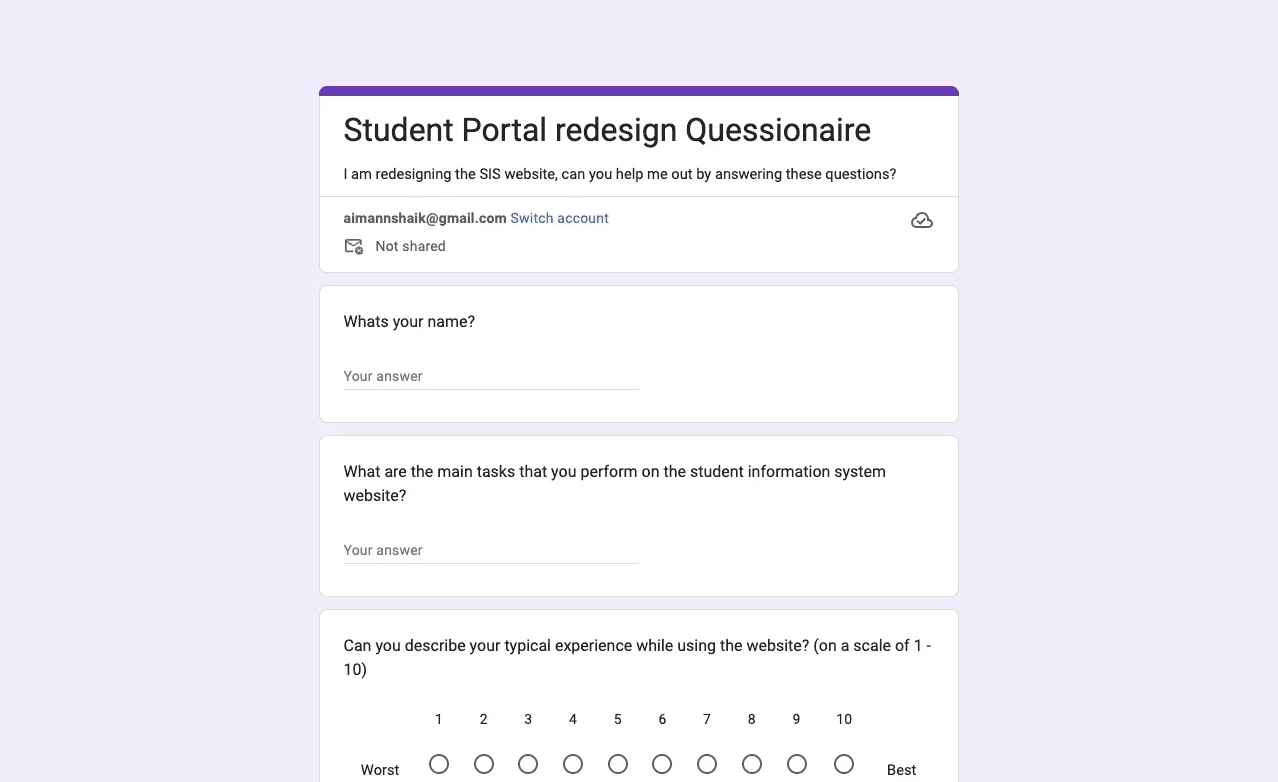
Before diving into solutions, I needed to understand the scope of the problem. I started with my own experience but quickly realized that wasn’t enough. I created a survey and sent it to fellow students, asking them about their struggles, needs, and priorities.
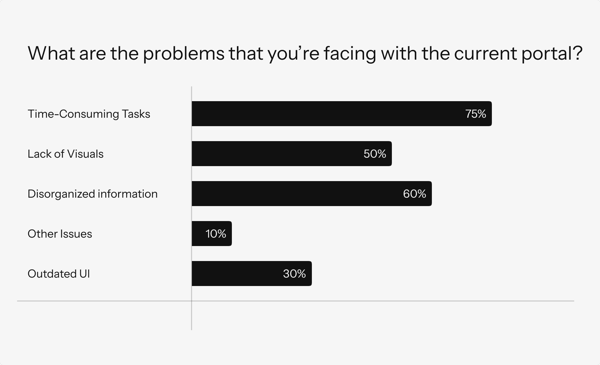
Key Findings from User Research
Their responses painted a clear picture:
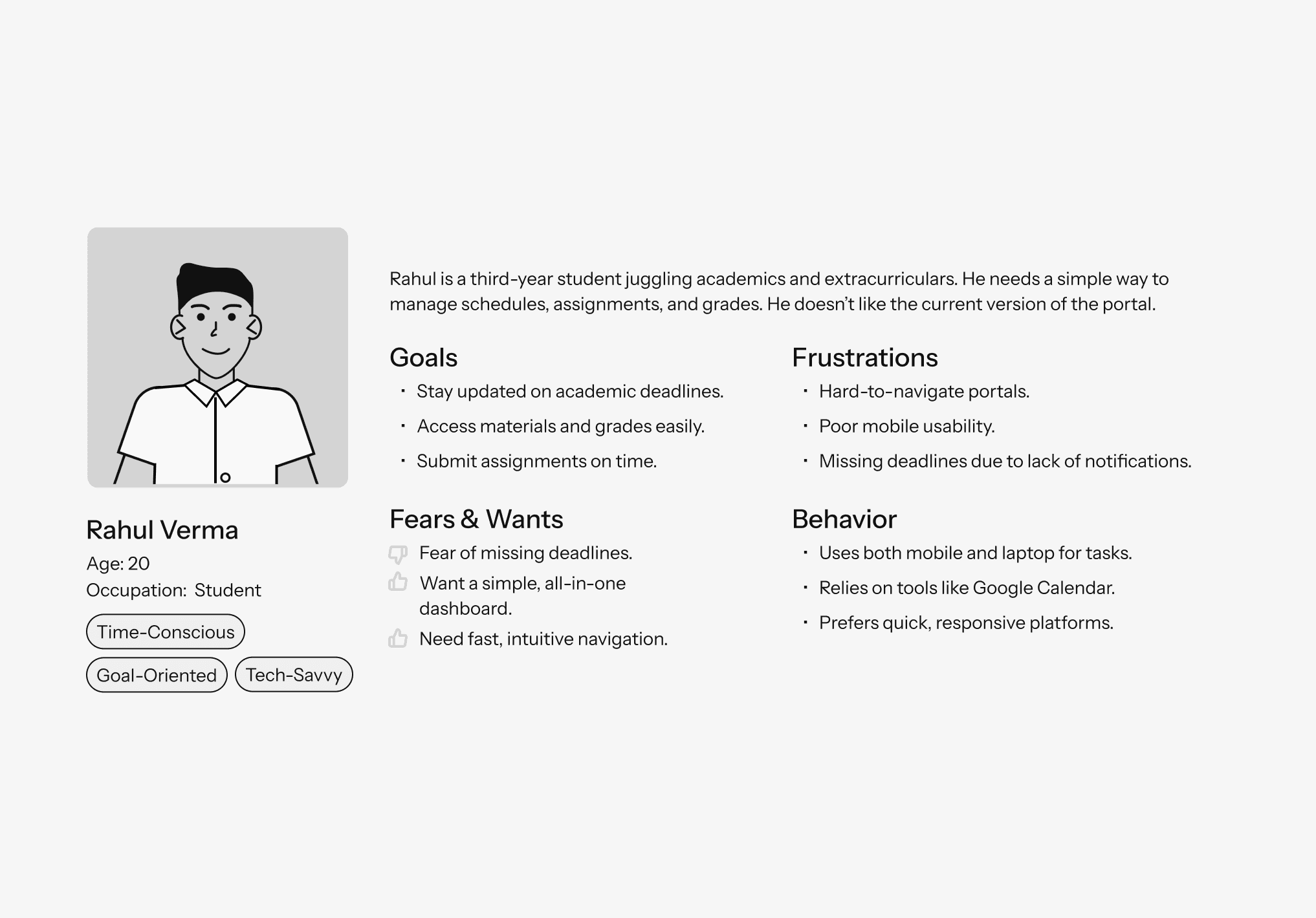
User Persona
The Description of an ideal user of the app.
Cracking the Code: Making Sense of the Chaos
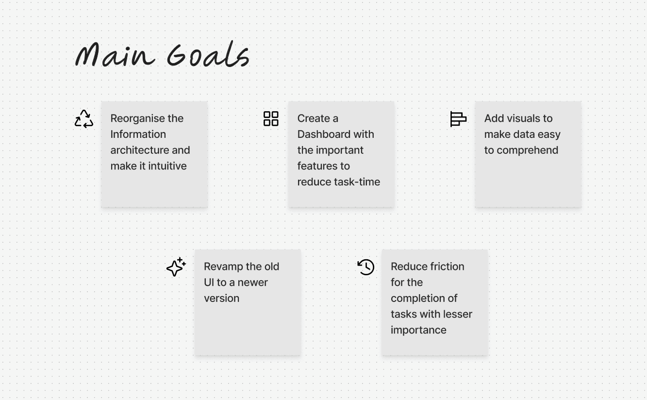
Based on the research findings, I focused on two major goals:
Simplify the Information Architecture (IA) to make navigation intuitive.
Introduce a dashboard for quick access to frequently used features.
Redesigning of the Information Architecture
The original portal’s structure was confusing, with redundant sections and unrelated features grouped together. I restructured the IA to improve usability while maintaining familiarity.
Interact and check out the Final Information Architecture
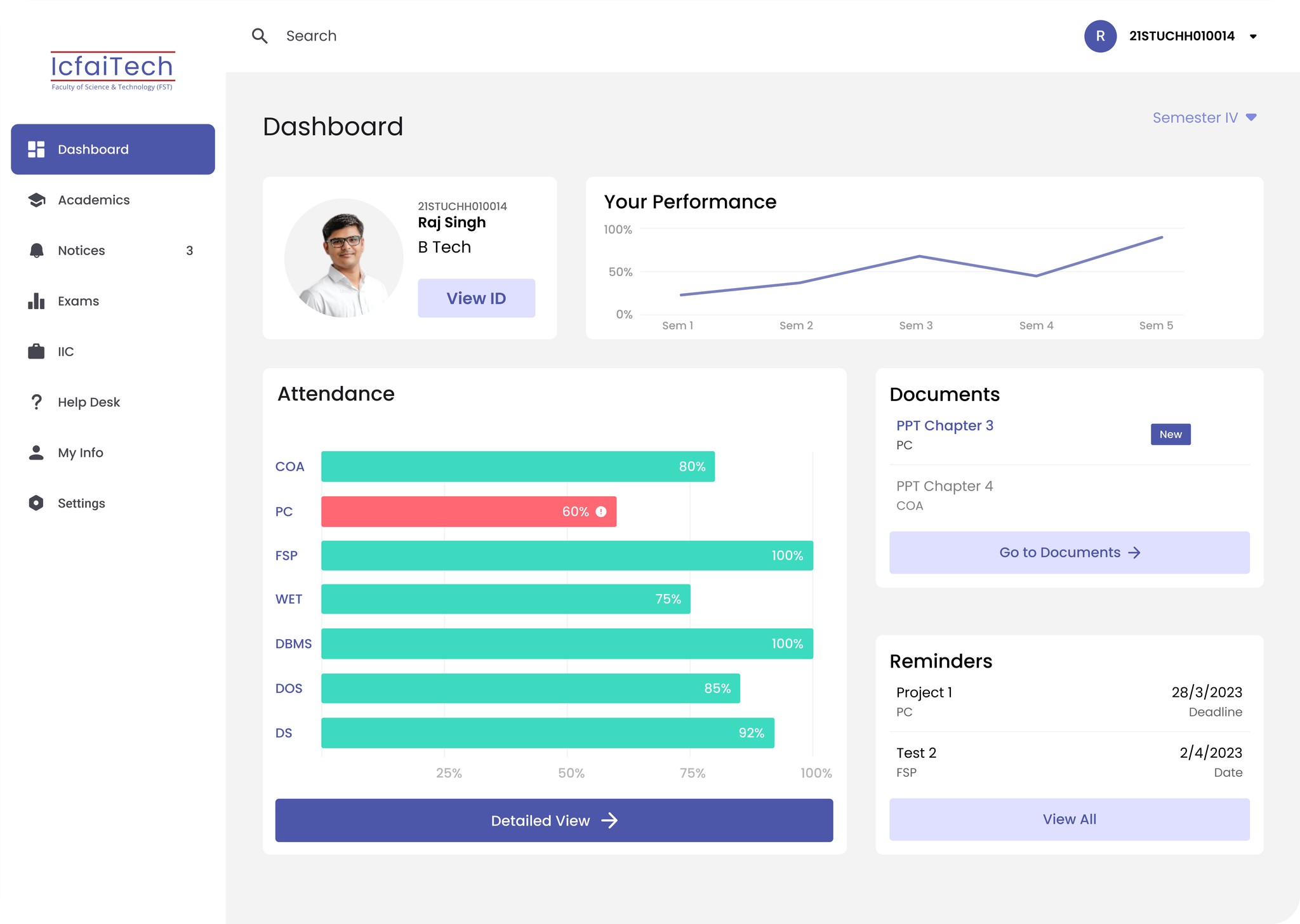
Centralizing Access : The New Dashboard Experience
Designing for students' ease
The introduction of a dashboard transformed the user experience. It became the central hub for all essential information.
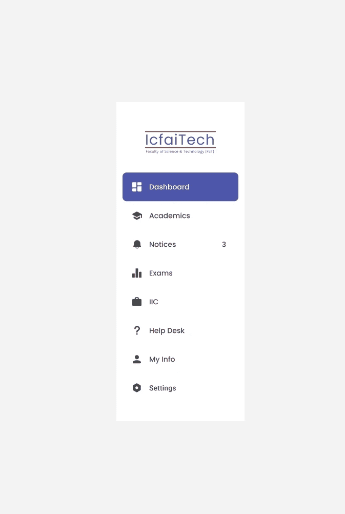
New and Better Navigation
Simple and intuitive navigation bar
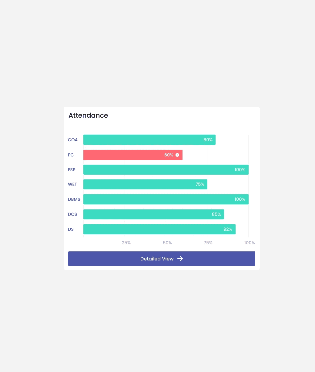
Attendance Graph
A visual, color-coded representation of attendance, with courses below the 75% threshold marked clearly.
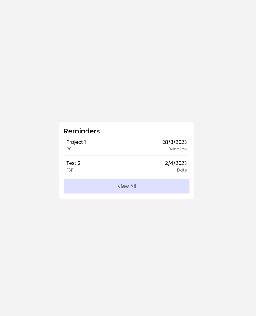
Reminders Card
A compact view of upcoming assignments and exams.
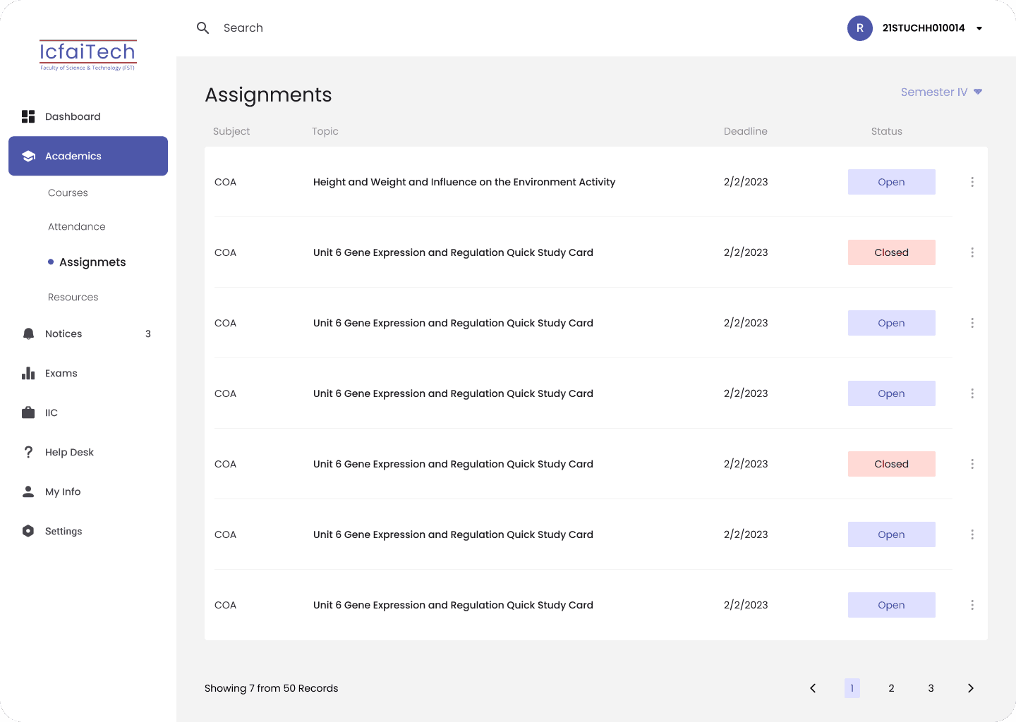
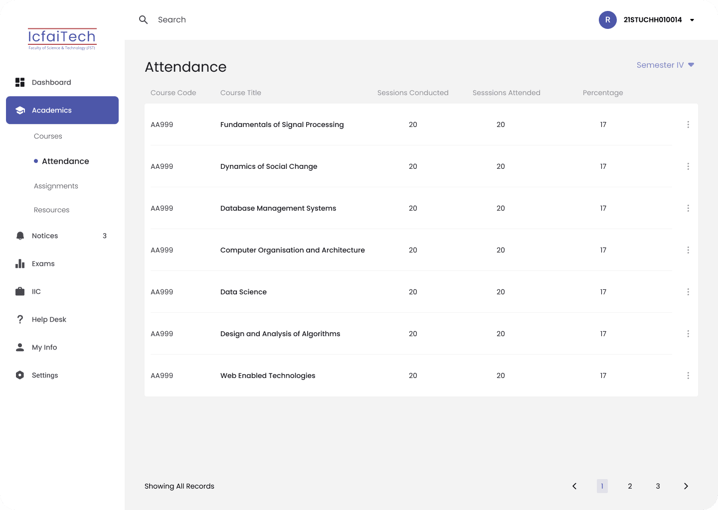
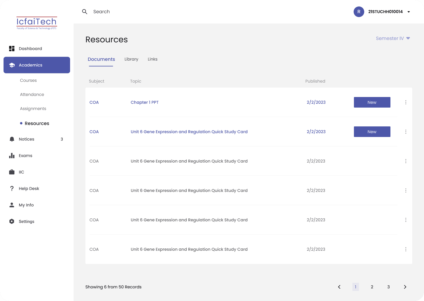
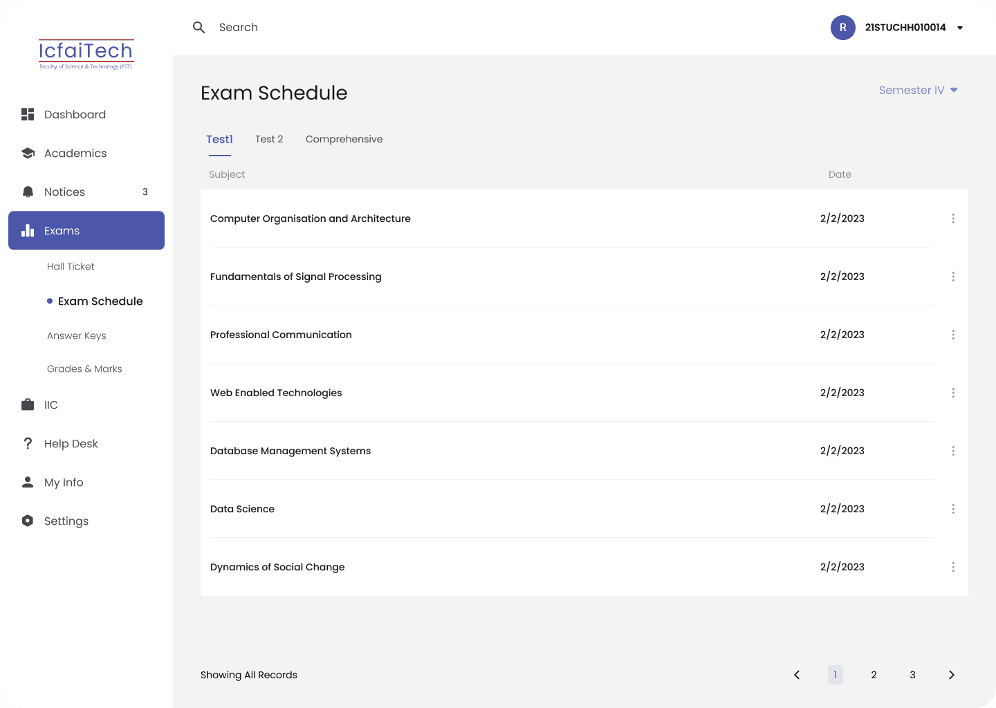
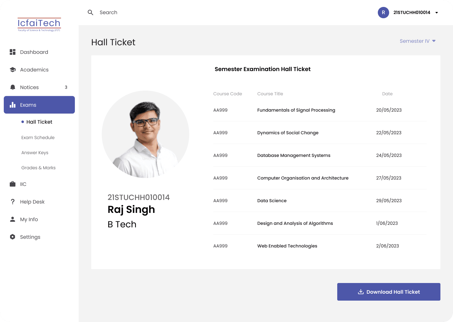
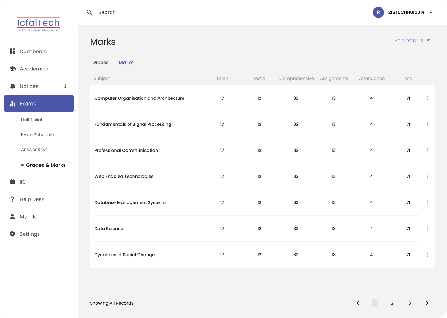
Better Design Everywhere
Improvement of other screens
Validating the Experience : Students Speak
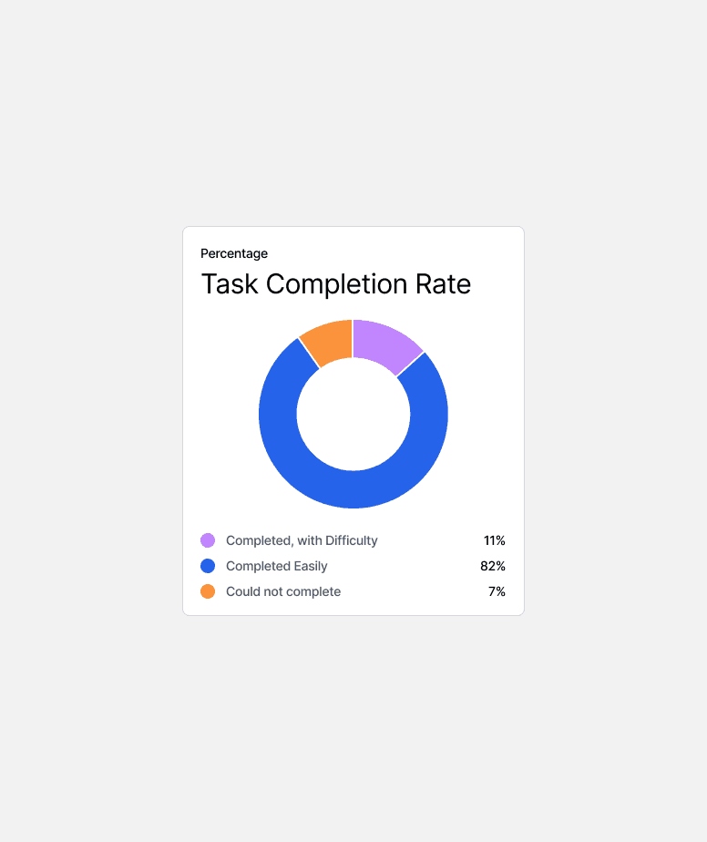
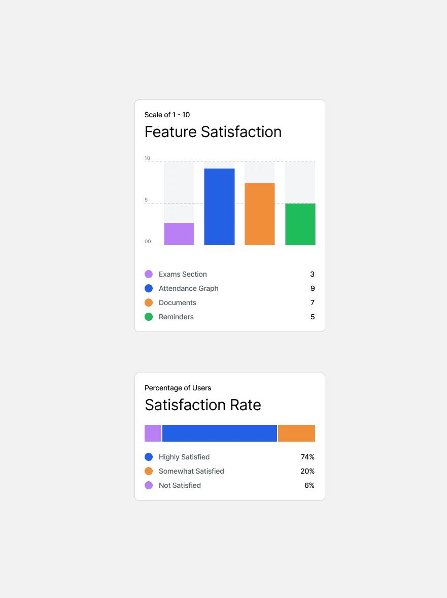
Once the design was complete, I tested it with fellow students to see if it delivered on its promise. I observed how they used the portal to perform their usual tasks, gathering valuable feedback along the way.
One student summed it up perfectly: “For the first time, using the student portal doesn’t feel like a chore.”